The existing design for MindTap was developed without specs for line art, charts, or graphs, so our task was to provide that. We created a style guide for these visuals that could be used in, and adapted for, all types of media (digital, print, etc.) in the Cengage portfolio. Using elements from the MindTap design specs as a starting point, we developed guidelines to help Creative Studio teammates create line art that will work seamlessly with everything in our product range.
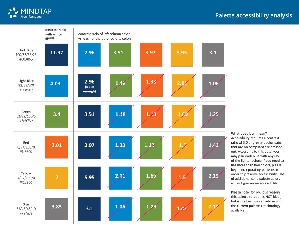
Accessibility is a major Cengage initiative—we’re creating valuable content, but we need to provide it in a manner that is accessible to learners with all kinds of abilities. We wanted to be sure that the new art would be compliant with current accessibility standards, and so we experienced a crash course in accessibility as we worked to make the charts, graphs, palettes, patterns, and typography meet the strict standards for as many learners as possible.
This project was a team effort, requiring Design, Content, and Accessibility to work very closely together. Developing art guidelines that adhere to accessibility standards was a welcome challenge—not only did the art have to work for print or the web, but there were many design constraints (namely concerning colors and element sizes). This required flexibility to seek alternative solutions throughout the process.